I generated a brief from sharpen.design, which was to create branded packaging for a brand of Japanese hot sauce. I looked at hot sauce branding and was interested in ones that were illustrative and had a simple layout. I had the idea of calling the brand 'Yokai' because the sauces in the range could be named after different yokai. Yokai are Japanese mythical creatures. I decided to focus on one sauce, so I could focus on the design and use it as an example to base any others on if I wanted to add new sauces to the range.
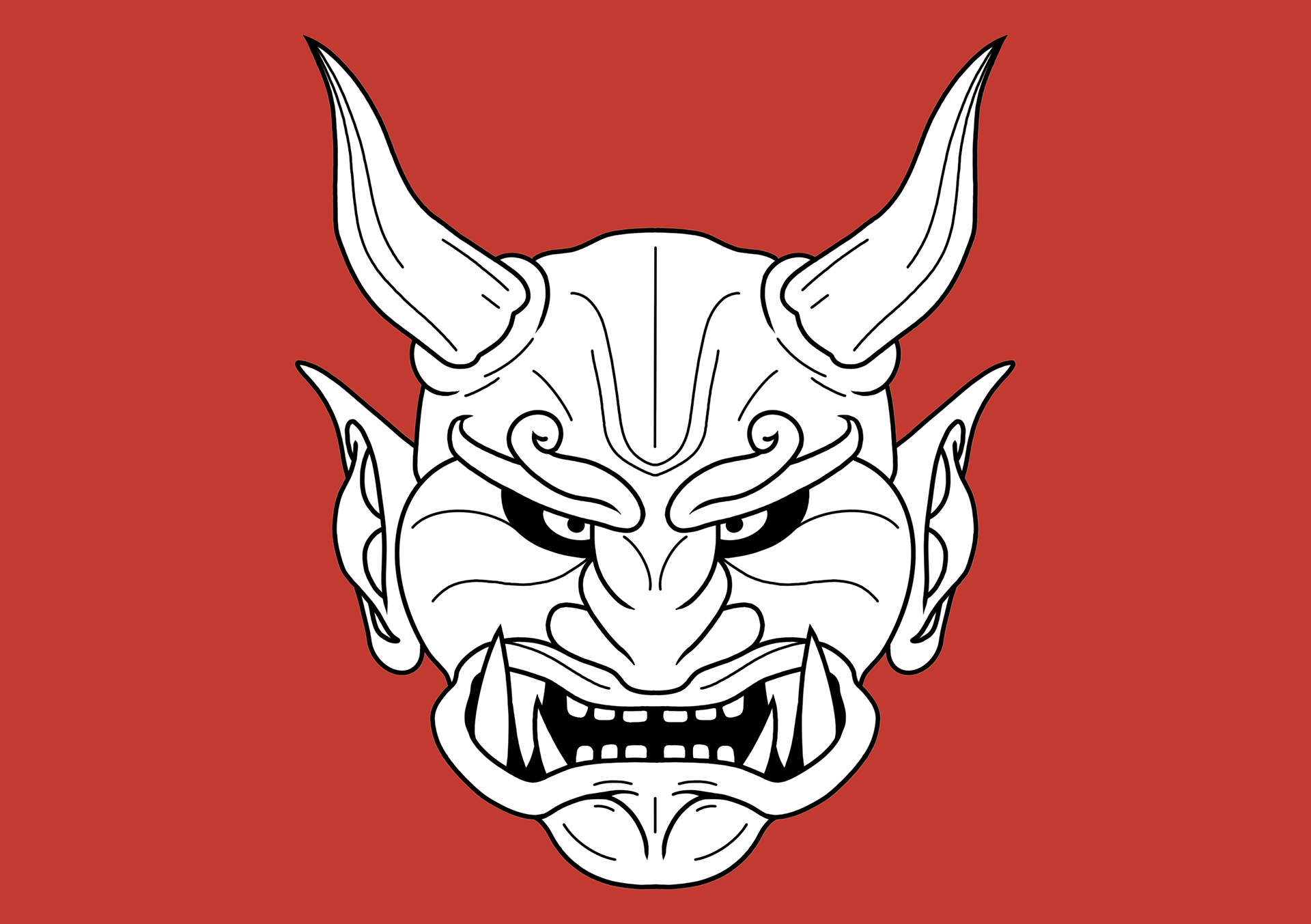
I started by sketching some ideas before moving on to different variations of my favourite idea. I chose to use an oni for the yokai of this sauce because it translates to "demon", which has connotations of heat and fire. I liked the idea of the oni in a circle because it separated it from the text and a red circle could be used to represent the Japanese flag.

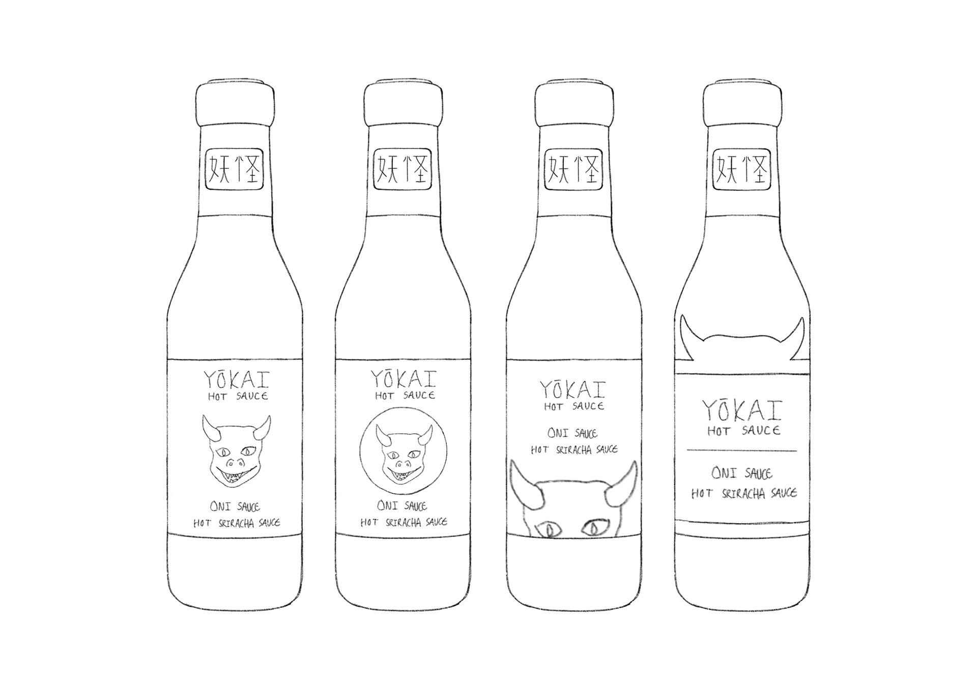
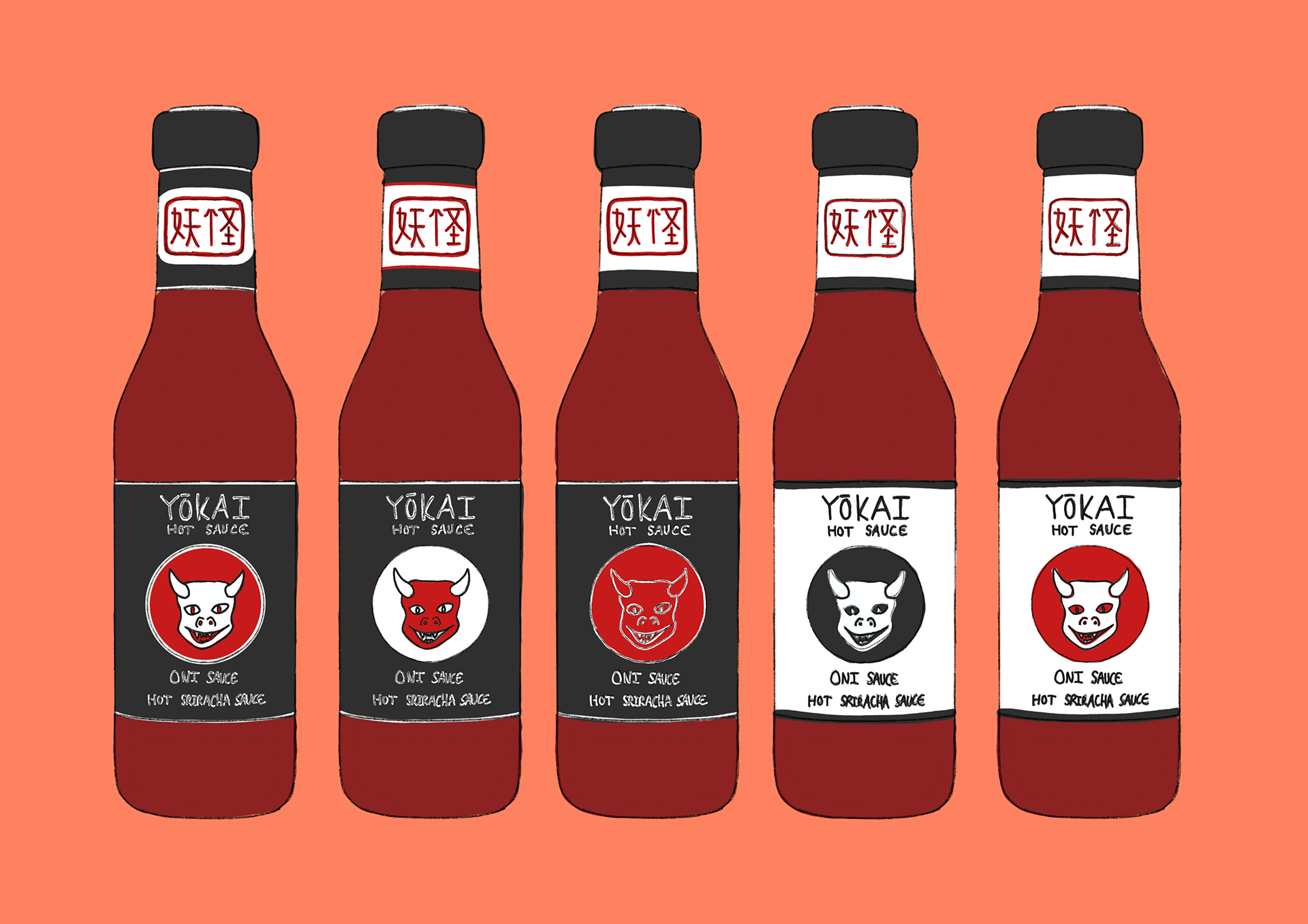
I went with this design because I thought the white ones contrasted too much with the sauce and made it look too bright. I chose the first colour combination because I thought it balanced each colour better. Old Japanese artists would finish their art with their signature in a red box, so I used this idea to add "Yokai" in Japanese to the neck of the bottle. I did this because I didn't want to leave it blank, but I also didn't want to put too much on it.