I was in the branding team for my degree's end of year show. We were in charge of creating outcomes for advertising the show, booklets, lanyards, and digital assets for the social media team. Everyone had to create their own idea for the show's branding, then we looked at them all and chose what we wanted to use.

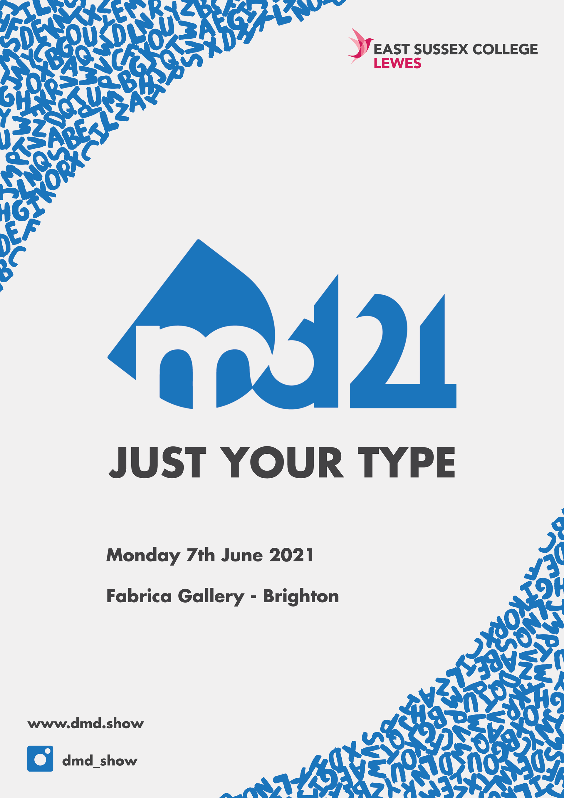
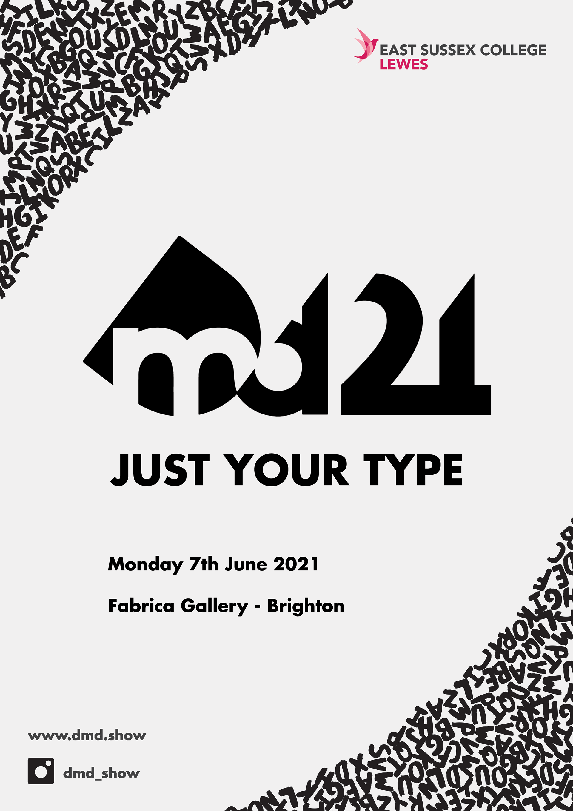
These are some initial ideas of how the posters could have looked. They feature an old idea for the logo and a letter pattern that I made with painted letters. I painted the letters with real paint to give them a handmade look. The name of the show was 'Just Your Type', so I wanted to use letters as a pattern that is used throughout all of the outcomes. The letter pattern was chosen to be used in the branding and it can be seen in the booklet, which was designed by someone else in the branding team.
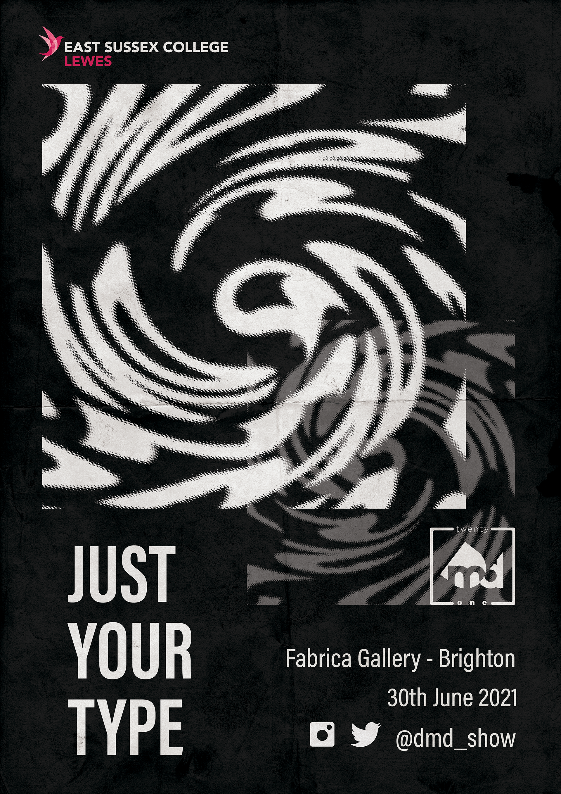

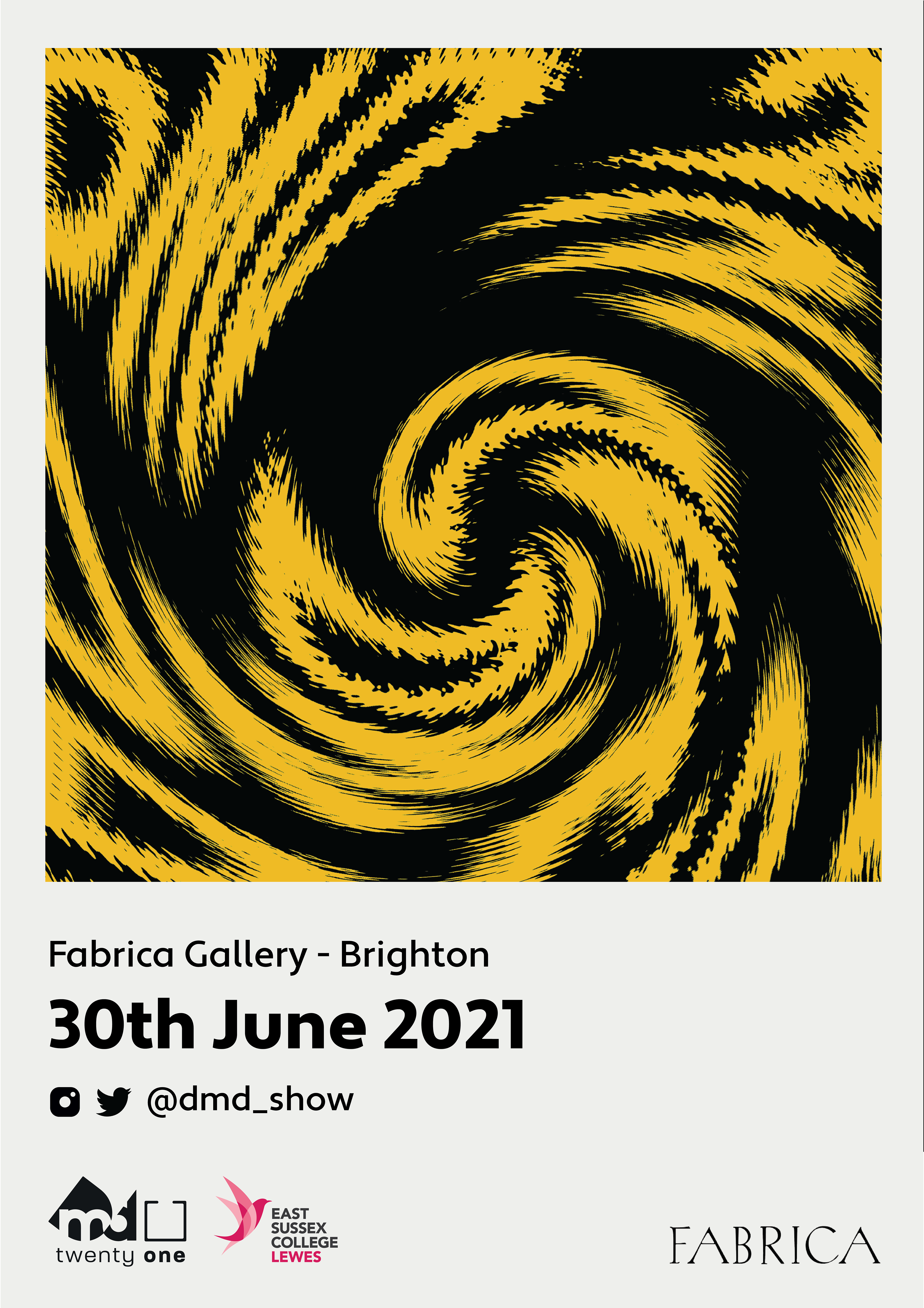
I made a black and white poster using 'DMD21' distorted to make a pattern. We decided that the posters should have the same layout with different imagery, so someone made a layout to be used across all of the posters. I only added the patterns to the second and third posters. We wanted to have posters for each subject in the degree, so we made some for graphic design, illustration, photography, and video. One of my strongest areas is illustration, so I provided some drawings for the posters.
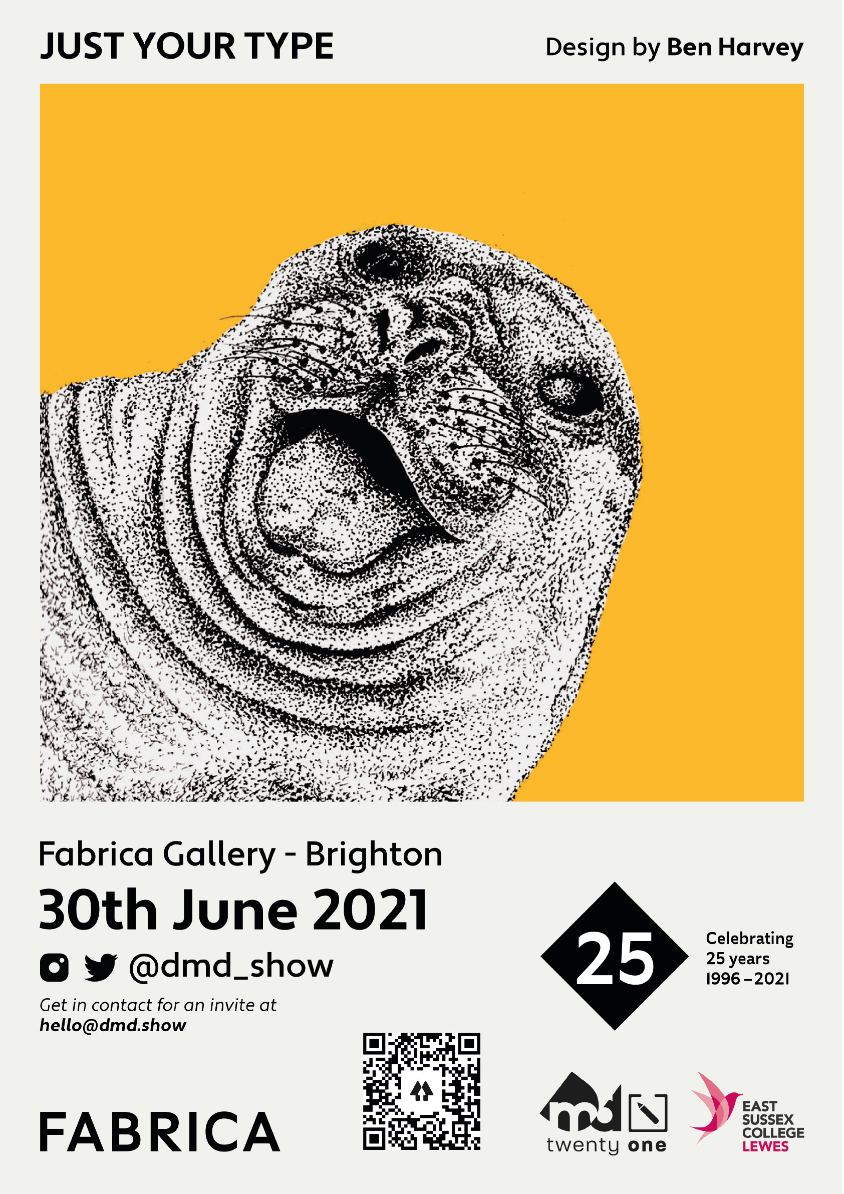
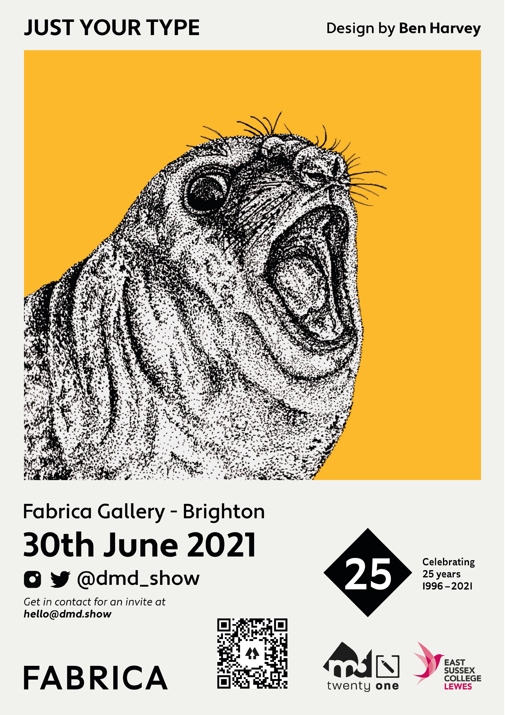
These posters were designed by someone else, but I provided the illustrations to be used in them. I used a yellow background because it worked well with the branding colour palette.

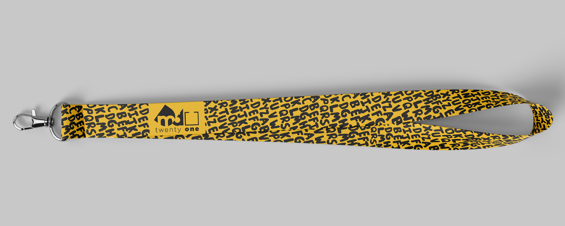
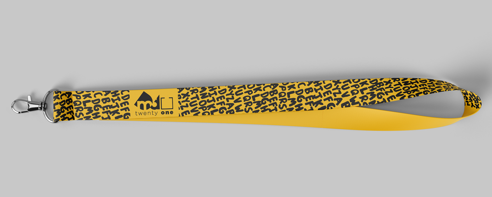

I made some mockups for the lanyards. We chose the fourth design but didn't end up getting them made because of changes to the budget. I used the painted letters from the old poster ideas because it created a nice pattern and it connected them to the show booklets, which also used the letters. We chose the design with one blank side and one patterned side, but we had to change it to a design that was mirrored on both sides because the company we were going to buy them from couldn't print them like that. I moved the blank part to the back, so we could keep the contrast from the previous design, but it could now be printed by our chosen company.